Seven Towns launch of Rubik’s ‘the Void’ into the European market. I explored a number of concepts, looking at shape and construction, materials, branding and packaging graphics.
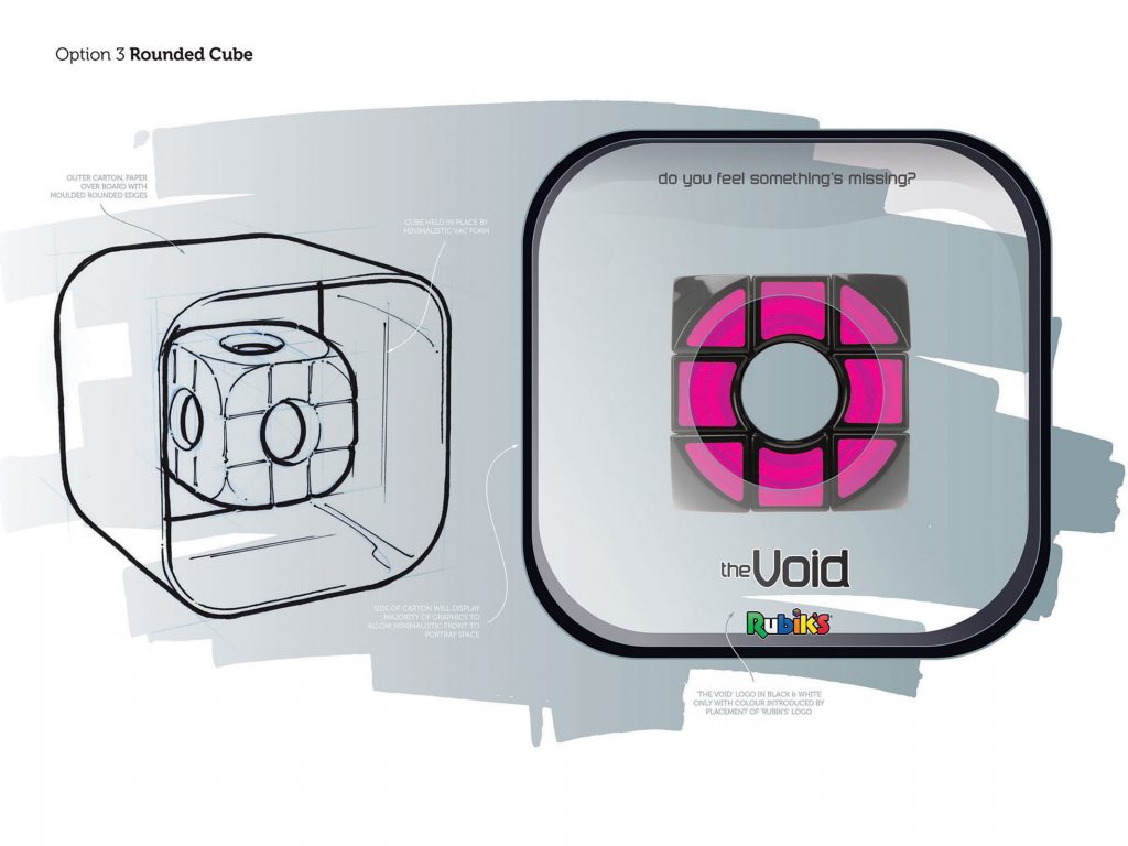
Option that puts the product floating in a space with minimal style packaging.
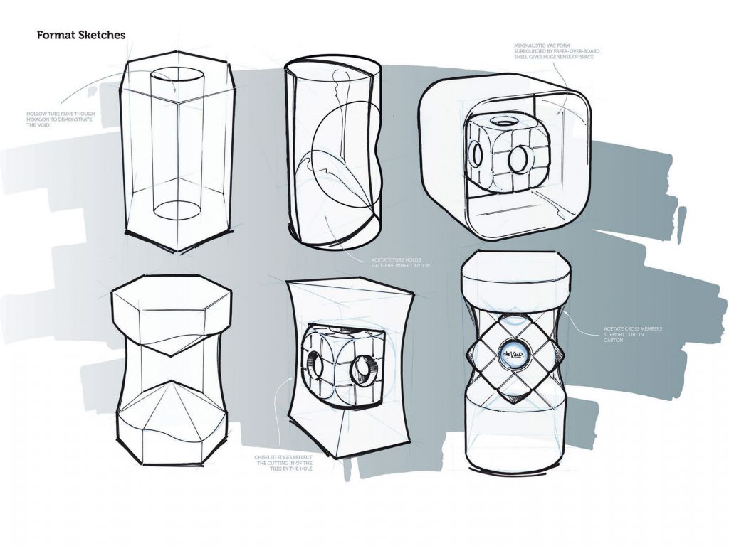
Here I explored construction formats and materials.
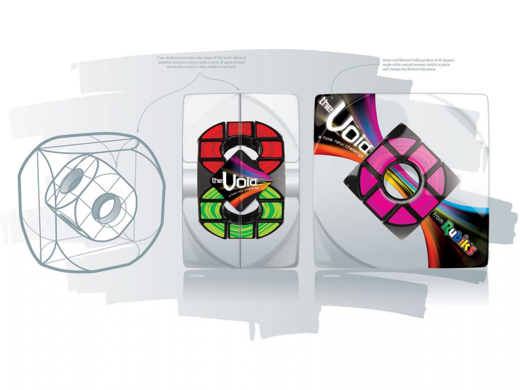
Development that puts the product entirely in a space in the form of a clamshell pack that is formed to represent the facets of the product. An inner card fitment runs through the centre of the cube, holding it at a 45 degree angle.
Logo which morphs characters as if being sucked into themselves like a black hole.
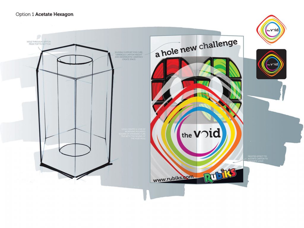
Logo with surrounding coloured frames that morph from square to circle that represents the product shape and creates a ‘tunnel’ effect.
Created while working as Senior Designer for WowMe!